
Neal Ashby & Matthew Curry: Visual Versions
Retro-Primitive and High Tech
With one foot in the past and one in the present, Ashby and Curry used Macs and Adobe Photoshop to produce the files that led to the finished packaging products. In some ways the process was retro-primitive, and in others, extraordinarily high tech.
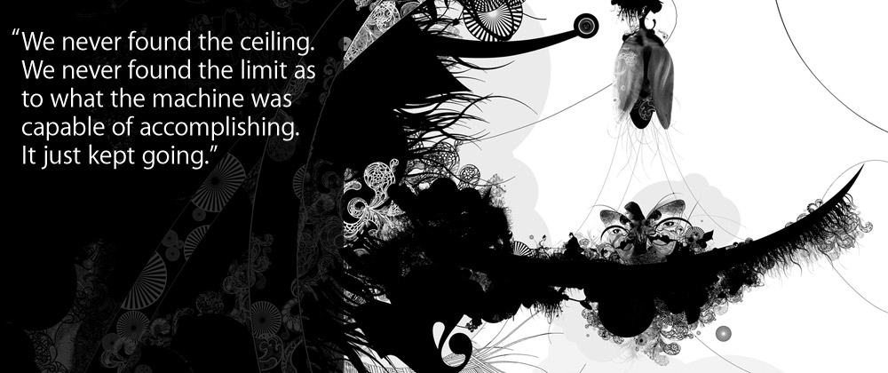
Preferring to use traditional pen and ink instead of a digital drawing tablet, Ashby hand-drew the hair that would grace parts of the CD cover as well as the CD disk itself. He then scanned the drawing and all other found artwork clippings into his dual-processor Power Mac G5, using a consumer-grade Canon scanner. “This $99 scanner was faster and better than a $4,000 Heidelberg scanner I had that was four to five years old,” says Ashby. “I scanned part of it, shifted it over and scanned it again, and shifted it over. I just kind of pieced everything together in Photoshop, and down to the pixel, it matches perfectly. It’s pretty amazing that it was done with nothing more than a pair of scissors, a Mac, and a $99 scanner, you know?”
At one point in creating the poster, Ashby and Curry found that they were working with a file that was half a gigabyte and 225 layers in size. “The idea that I could work on a 515-meg Photoshop file with literally not even a split second of hesitation as I scrolled, as I option-clicked through all the layers, it was really a revelation,” says Ashby. “When Matt and I started this, we questioned what the limits were going to be, how much stuff can we put on this computer, and we never found the ceiling. We never found the limit as to what the machine was capable of accomplishing. It just kept going.”
“I don’t think the fluidity of the project as a whole would have been there if we weren’t working on the Mac systems,” adds Curry. “I was doing these heavily layered Photoshop things and it wasn’t freezing on me and making me pull my hair out and turn the computer off and walk away from it. So yeah, it was very beneficial.”
“An Album Cover Is Timeless”
Ashby is old enough to remember the excitement of the old days, which meant slitting open the plastic on a favorite band’s new LP to discover what artistic goodies lurked inside. Perhaps there’d be a poster to hang on the wall, or stickers to use on book covers. Maybe there’d be an illustrated booklet with interesting liner notes and photos.
He recalls how strongly music became identified with the visual images in the packaging, and how classic album covers have become enduring works of art. And it’s his desire to make sure that this important connection between music and art continues, despite the shift to digital media.
“There was a lot of fear in the music community that because of music getting digitized that we were going to lose the album cover,” he says. “What’s so amazing is that we’re realizing that the album cover is timeless, that it has intrinsic value, and that people love it.
“I’m really interested in seeing the next level of how graphic design and music is married in the iPod generation,” he adds. “There’s a connection emotionally between art and music, and just because music moves into a new medium doesn’t mean that connection won’t always be there.
“You can live in fear it will disappear and lament it, or you can say, wait a second, there’s an opportunity here,” he adds. “Imagine if you’re a young girl sitting on a bus and you’re listening to Justin Timberlake. Wouldn’t it be cool to just tap on the album cover and go through a photo gallery while listening to the music, or maybe a video pops up? The opportunities are endless. The next ten years are going to be really defining and interesting for graphic designers and the music industry. It’s not going to be the business model we’ve been used to, but it’s going to be exciting.”